%matplotlib inline
import numpy as np
import matplotlib.pyplot as plt
import seaborn as sns
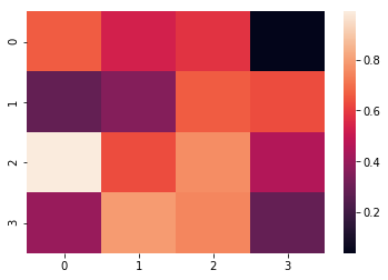
# f1: 默认
data = np.random.rand(4,4);print(data)
sns.heatmap(data);
# output
[[0.66551277 0.53291346 0.58329178 0.03840753]
[0.28192606 0.35637815 0.66603227 0.63488134]
[0.98989239 0.63482035 0.76583562 0.45823605]
[0.40120982 0.7955449 0.74902682 0.28705992]]
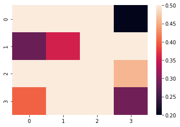
# f2: 设置颜色版的取值范围
sns.heatmap(data, vmin=0.2, vmax=0.5);
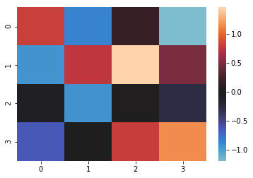
# f3: 以0为分界,展示正负数据
data = np.random.randn(4,4);print(data)
sns.heatmap(data, center=0);
# 航班数据集
flight = sns.load_dataset("flights")
flight.head(3)
year month passengers
0 1949 January 112
1 1949 February 118
2 1949 March 132
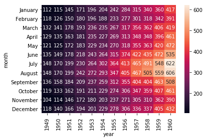
# 数据透视表
flight = flight.pivot(index='month', columns='year', values='passengers')
flight.head(3)
year 1949 1950 1951 1952 1953 1954 1955 1956 1957 1958 1959 1960
month
January 112 115 145 171 196 204 242 284 315 340 360 417
February 118 126 150 180 196 188 233 277 301 318 342 391
March 132 141 178 193 236 235 267 317 356 362 406 419
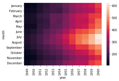
# f1: default
ax = sns.heatmap(flight)
# f2: 格子中显示数值
ax = sns.heatmap(flight, annot=True, fmt="d")
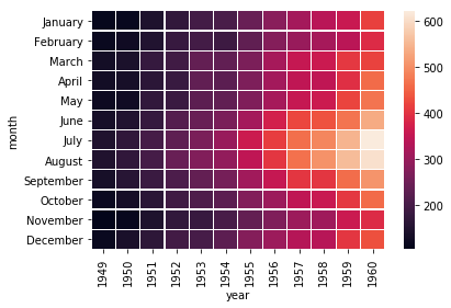
# f3: 增加空隙
ax = sns.heatmap(flight, linewidth=.2)
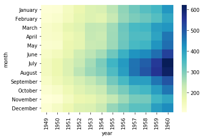
# f4: 设置调色板
ax = sns.heatmap(flight, cmap="YlGnBu")